Understanding abstracts: Does the study say what you think it says?

I spend a lot of time on this blog talking about scientific studies and how to analyze them, but there is a very important topic that, until now, I have only mentioned briefly: abstracts. Abstracts are intended to be useful tools to help scientists decide whether or not to read a given paper, but they are often misused and abused. Indeed, it is extremely common for people to base an argument entirely on an abstract. Even more disturbingly, I often see people citing conference abstracts as evidence. On numerous occasions, I have seen someone claim that, “A new study found X,” and when I follow the link, the study that they are referring to was presented at a professional conference, but has yet to be peer-reviewed.

scientific abstracts are not the same as papers meme funny peer-review

There is a huge difference between reading a study and reading the study’s abstract

To be clear, this is in no way a problem that is specific to those who routinely deny well established science. Rather, this is a problem that is rampant among staunch supporters of science as well. Therefore, in this post, I want to explain what abstracts are actually intended for, how you should use them, and how you shouldn’t use them. I also want to spend some time specifically on conference abstracts, because they are a special case that deserves extra attention.

The real purpose of abstracts
To begin with, I want to briefly explain what abstracts are actually intended for. Their purpose is simply to help researchers decide whether or not it is worth their time to locate and read the entire paper. This is a very useful function because critically reading scientific papers takes a long time. I’m a fairly fast reader, but if I want to really understand a paper, and go through all of the proper checks to make sure that it was done correctly, it will take me a minimum of one hour to read it (usually a lot more). So, given the millions of papers that have been published, a single scientist clearly can’t read all of them. Even within their chosen discipline, there will generally be far more papers than they could realistically read.

This is where the abstract comes in. A well written abstract will contain a very brief explanation of the background and importance of the study, a brief explanation of how the study was conducted, and the key results of the study. Scientists will then use that information to determine whether or not that paper is relevant for the question that they are working on. That’s it. That is the purpose of an abstract. It is to help scientists maximize their efficiency by focusing on papers that are relevant to them. It is not intended to be a through summary that you can read instead of reading the actual paper.

Think of abstracts like the descriptions on the back of a DVD case. You aren’t supposed to read the description instead of watching the movie. Rather, you are supposed to use the description to decide whether or not to watch the movie, and it would be silly to enter a debate about a movie for which you have only read the description. Similarly, you should use abstracts to determine which papers are worth reading, but you shouldn’t read the abstracts instead of reading the papers themselves.

Why you shouldn’t trust abstracts
The common tendency to read abstracts instead of the actual studies is extremely problematic because you can’t do any of the normal quality checks with just an abstract. Unfortunately, not all scientific studies are conducted properly. There is a lot of junk science out there. So, whenever you read a scientific study you need to very carefully look at the experimental design to make sure that it was set up correctly (e.g., was it properly randomized, did it use proper controls, etc.), you need to look at the statistics to make sure that they were done correctly, you need to look at the conclusions to make sure that they are justified by the results, etc. None of that is information that you can get from an abstract. So the abstract may look great, but the study itself might be fundamentally flawed. For example, last week I dissected a recent study that claimed that Splenda causes cancer in mice, and most of the things that I commented on were things that I could not have assessed from just the abstract. If all that I read was the abstract, I never would have seen things like the questionable statistics or inconsistent results.

This brings me to my next major point: abstracts often misrepresent studies. It is very easy to write a misleading abstract. Because abstracts are brief, they generally only highlight key results, but this means that authors have the opportunity (whether intentionally or unintentionally) to only present the results that support their conclusion while ignore results that challenge it. Similarly, abstracts generally include a general conclusion statement from the authors, but I have seen many, many cases where that conclusion statement really wasn’t supported by the data in the paper. To put this another way, abstracts often reflect the authors’ opinions about their study rather than the actual results of the study.

Finally, abstracts, like DVD cases, are designed to make you want to read the rest of the study (or watch the movie). They are scientists’ opportunity to advertise their research, and this sometimes results in abstracts that oversell the significance of the research or gloss over serious problems. To make another movie analogy, it would be silly to judge a movie by its trailer. Even so, you shouldn’t judge a paper by its abstract.

All of this simply means that you need to read the study itself before you either cite it as evidence or conclude that it is not good evidence. Reading the abstract is not enough to tell you what the study actually found or if you should even accept its results.

Understanding conference abstracts
Scientific conferences are lots of fun. I always look forward to them because I get to meet my fellow scientists (often including the great minds of my field), as well as presenting my own research and learning about other people’s research (btw, you can go to these meetings even if you aren’t a scientist, and if you are really interested in science, I highly recommend it). In a situation that is similar to the scientific literature, however, most meetings have more talks than one person can attend (there are usually several sessions running concurrently). So, much like the abstracts for papers, conference abstracts are simply intended to help people figure out which talks they want to see. Thus, they are very similar to the abstracts for papers, but there are a few key differences that make them even more dubious as sources of evidence.

First, conference abstracts generally aren’t peer-reviewed (there are a few exceptions, and some conferences even require a short paper, but that is not the norm). In other words, conference abstracts are usually accepted or rejected entirely based on whether or not they fit within the scope of the conference. This is extremely important because it means that other scientists have not meticulously examined the research to make sure that it is of a high quality. In other words, having an abstract accepted to a conference is in no way an affirmation that the research is solid or that the results are trustworthy. Even for the few conferences that review the abstracts, the review process is generally much less stringent than it is for publishing a paper in a journal.

Indeed, it is extremely common for the research in presentations/posters to never see the glorious light of publication, and if I am going to be totally honest, this was the case for one of my very first research projects as a lowly undergraduate. This is, in fact, commonplace for conference presentations. I have sat through some truly horrible talks, but the abstracts for those presentations generally looked great.

This brings me to me next major point. Remember earlier how I said that you need to critically analyze papers? Well you can’t do that with conference abstracts. This is the primary reason why they should not be used as evidence. When someone cites a conference abstract to back up their claim, all of that you have is that abstract. You have no way of checking the researchers’ methods, statistics, detailed results, etc. Which means that you have absolutely no way of knowing whether or not study was done correctly.

Further, talks and posters at conferences are often on projects that are currently in progress. As a result, they often include incomplete sample sizes and preliminary results. Thus, even when a talk does go on to be published in a reputable journal, the final data and conclusions in the paper often differ from the conclusions in the talk.

Similarly, another important function of conferences is actually to get feedback on your research prior to submitting it for peer-review. It is extremely common for the question and answer section of talks to include comments from other researchers such as, “Have you tried X?” or “You need to make sure that you account for Y.” These comments can be extremely helpful in refining your analyses and improving your research, but because they are always made during the conference, they do not get included in the abstract. In other words, the abstract is on the unrefined version of the data that has yet to receive casual feedback from your peers, not alone formal peer-review.

Advice on getting copies of papers
At this point, you may be thinking, “This is all well and good, but half the time the paper is behind a paywall, so all that I have is the abstract.” That is admittedly a real problem, but there are ways around it.

First, for conference abstracts you need to try to figure out whether or not the study has actually been published in a proper peer-reviewed journal. If it has, then you should read that study, and ignore the conference abstract. If it has not been published, the you should not be citing the abstract as evidence (sometimes a lack of publication is actually a sign that the paper was flawed).

As far as the actual papers, getting them can be challenging. The first thing to do is check both Google and Google Scholar. You can often get free copies of papers from them (note: most journals allow authors to self-archive their papers, so those pdfs often are legal). If you can’t get them there, you might be able to get them via your local library, especially if you have access to an academic library on a college campus. Even if you aren’t a student, many universities have a library that members of the public can visit, and those libraries usually contain a large periodical room where you can read and photocopy/scan articles from lots of different scientific journals.

Another option is simply to email the authors. You can usually get the lead author’s email address without actually paying for the paper (or if nothing else, Google them), and scientists will usually be more than happy to send you a free copy of their papers. So don’t be afraid to send them a brief, polite email asking for a copy of the paper. Preferably, include something like, “paper copy request” in the subject, and include the full title of the paper you want in your email. Don’t just say something like, “I want a copy of your paper on vaccines” because odds are that they have many papers on vaccines.

Conclusion
The take home message from this post should be self-evident, but I will state it anyway. Abstracts should not be used as evidence. They do not give you enough information to properly assess a study and they often reflect the authors’ biases rather than the actual results of the paper. Abstracts from conferences are even worse because they are often on preliminary data and generally have not undergone peer-review. Therefore, you need to read the actual study itself, not its abstract.

 Other posts on understanding scientific papers

Posted in Nature of Science | Tagged , , | 7 Comments

Does Splenda cause cancer? A lesson in how to critically read scientific papers

how the media describes science vs what the paper said

Image via Mommy PhD

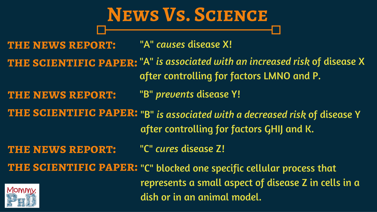
Last week, researchers published a paper suggesting that sucralose (Splenda) causes cancer in male mice. This has re-sparked an old debate, and various media outlets have been quick to pounce on the results and flood the internet with articles like, “The scary reason why you should stop using Splenda ASAP” or “Splenda linked to leukemia, study finds: New study finds sweetener unsafe.” Meanwhile, other people have taken a pendulum swing to the opposite conclusion, and are claiming that the study actually showed that Splenda reduced cancer rates in female mice. In situations like this, you always need to look at the actual study, not the headlines, because more often than not, the actual study is very different from what the media is reporting. Therefore, in this post I want to look at the study itself, and use it as teaching tool to give an example of how you should analyze scientific papers. This is a topic that I have written about many times before (for example, here, here, and here), but I think that this paper provides a particularly nice illustration.

To be clear, I am not going to engage in an overarching discussion about whether or not Splenda is safe. Rather, I am simply going to analyze this particular paper to see whether or not it supports that conclusion that Splenda is dangerous (if you are interested, you can find a nice review of the evidence for its safety in Grotz and Munro 2009).

Overview of the study
The actual paper in question is: “Sucralose administered in feed, beginning prenatally through lifespan, induces hematopoietic neoplasias in male Swiss mice” by Soffritti et al., and it was published in the International Journal of Occupational and Environmental Health. In short, the authors took a large group of Swiss mice and split them up into several treatment groups which received different amounts of sucralose mixed with their food (0 ppm [control], 500 ppm, 2000 ppm, 8000 ppm, 16000 ppm). The mice were first exposed to sucrose as fetuses (i.e., the pregnant females were given the food), and they continued to receive food that contained it every day for the rest of their lives. At the end of the study, surviving mice were euthanized and all of the mice were dissected to look for various cancers. The authors then concluded that in male mice that received 2000 ppm diets or 16000 ppm diets (but not 8000 ppm) there was a significant increase in the rates of certain cancers.

Limitations and applicability
Whenever you read a study like this, one of the most important things to do is look at how widely applicable the results are. As I have previously explained, scientific studies often have very narrow, specific results, whereas the media reports are generally extremely broad, and that is certainly the case for this study.

hierarchy of evidence scientific

Not all studies are created equal (details here).

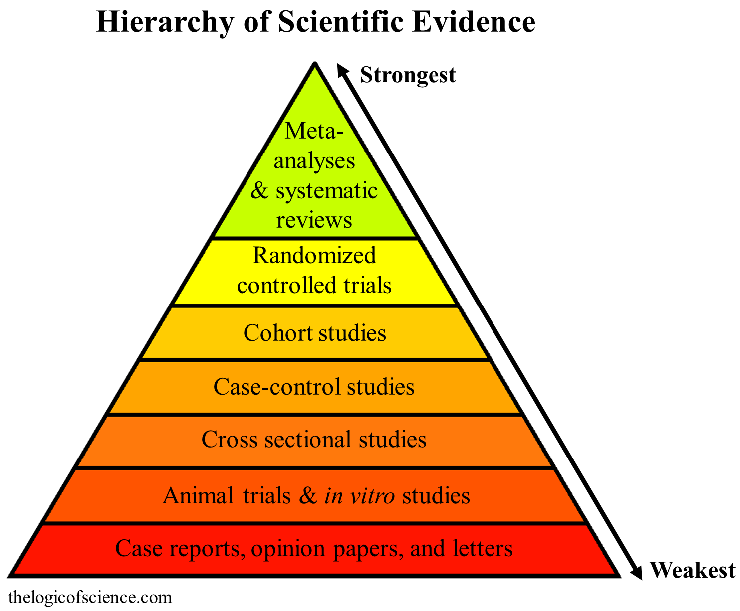
First, this was a study on mice, not humans. This is extremely important because there are many different types of scientific studies, and different types are used for different purposes. Thus, you always need to look at the type of design being used (details here). Some designs (such as mouse studies) are intended only as preliminary studies that should be used to fuel future research. Mice and humans have biochemical differences, and foods, drugs, etc. often behave differently in mice than in humans. So even if a study convincingly showed that a chemical causes cancer in mice, you could not jump to the conclusion that it causes cancer in humans. Rather, you should use that study as the basis for getting funding to test the chemical in humans.

Additionally, this study only found significant increases in the cancer rates of male mice. There were no significant increases in female mice. So even if you want to prematurely apply this study to humans, you can only apply it to males, not females. Again, look for caveats like this when you read papers.

Also, you always need to remember that the dose makes the poison. Almost everything is toxic in a high enough dose, and even water can be fatally toxic. So whenever you see sensational headlines, you should take a good look at the dose that was being used, because it is often much higher than anything that you would actually be exposed to.

In this particular case, the significant effects were only observed at very high doses. The lowest treatment category was 500 ppm. Using ppm (which stands for parts per million) for dry food is highly unusual (it’s normally expressed as mg/kg [i.e., milligrams of chemical per kilogram of subject), so I was very confused when I first read the paper, but apparently, the authors have now clarified that 500 ppm is roughly equivalent to 60 mg/kg in mice or 4.9 mg/kg in humans (see Reagen-Shaw et al. 2008 for details on the conversion). This is important because the FDA recommendation is to eat no more than 5 mg/kg of sucralose a day. So, their lowest exposure group was roughly the same as the maximum daily amount recommended by the FDA.  However, they did not detect significant effects until 2000 ppm (which I presume is 240 mg/kg in mice or 19.5 mg/kg in humans). In other words, the risk did not increase until a group that received roughly four times the recommended maximum dose! So this study absolutely does not support the conclusion that a normal exposure to Splenda is dangerous. In fact, the category representing the maximum recommended dose had no significant effects. So if anything, this study supports the conclusion that our current exposure rates are safe (remember, everything is dangerous at a high enough dose, so its hardly surprising to learn that taking more than the recommended maximum dose is dangerous, and it does not suggest that the recommended dose is dangerous).

Note (18-Mar-16): originally, I had erroneously claimed that the lowest dose category was 12 times the recommended dose in humans; however, it was pointed out to me in the comments that I simply applied the mg/kg in mice to humans, and I should have done a conversion. I apologize for the mistake and have corrected it throughout the post; however, the mistake did not significantly change any of my arguments or conclusions.

Finally, the applicability of this study is limited because mice received Splenda throughout every life stage (gestation, nursing, adolescence, and adulthood), which makes it impossible to know which stage is important. For example, it could be that the important effects only happen during gestation, and those effects carry over into the rest of life. In which case, Splenda is fine during any stage after birth. Alternative, it may only be important while nursing or while growing. Based on this study, you simply can’t make the generalization that Splenda is dangerous for adults, because the results in the paper aren’t that specific. In other words, this study took an extremely broad approach to the problem, and you should be aware of the limitations that such a wide approach entails.

Hopefully you can now see the problems with the media hype. Even if the study’s results were reliable (which as I’ll show in a minute, they aren’t), all that it would have shown is that absurdly large doses of Splenda cause cancer in male mice if they receive it over the course of their entire lifespan. That’s hardly a result that should be causing people to flush their Splenda down the toilet.

Experimental design
Having now established that the claims being made by the media are clearly bogus, we need to turn our attention to the design of the study to see if it was even set up properly. The first thing to look at is the randomization process. In any study like this, it is very important to properly randomize your subjects, because this minimizes the chance of an unknown confounding factor skewing your results. In this case, they started the trails during gestation, so it is actually the parent mice which needed to be randomized, not the test subjects themselves. What the authors did, however, is a bit odd. They described their randomization process this way:

“The breeders were randomly distributed by weight into three groups of 40 and two groups of 60, encompassing the same number of males and females (n = 240).”

This is very confusing for two reasons. First, what do they mean by, “randomly distributed by weight”? Distributing randomly and distributing by weight are mutually exclusive. Either they grouped them by weight (e.g., a group of 10–15 gram mice, a group of 16–20 gram mice, etc.) or they randomly selected who would go into which group, but they can’t have done both. Second, why three groups of 40 and two groups of 60 instead of six groups of 40 or four groups of 60? It may seem like I am nit-picking here, but this information is actually important.  If they did not properly randomize and block their experiment, then their results will be unreliable, and the information provided in the paper simply isn’t enough to tell if they did it right.

By itself, this confusing set up is clearly not enough to discredit the research, but it is a clue that something isn’t right, and it demands a closer scrutiny of the paper. As you read scientific papers, you should watch out for irregularities like this, because they are often indicative of underlying problems.

Statistics
Next up, we have their statistical design, and this is where things become really troubling. Whenever you are writing a scientific paper you are supposed to describe your analyses in enough detail that someone else could take the same data set that you analyzed, do the exact same analyses that you did, and get the same result; however, in this paper, the description of the statistical design is exceedingly unsatisfactory. All that the paper says is,

“The statistical analyses of survival and of the malignant neoplastic lesions were based on the Cox proportional hazard regression model, which adjusts for possible differential survival among experimental groups.”

That’s it. That’s all the the authors told us about their design. In fact, they didn’t even bother to mention another analysis method that they apparently used, because if you look at their results, you will also find that they calculated a Kaplan–Meier estimate, but they never explain how they set that up. This is an enormous problem because it leaves the readers in the awkward position of having to assume that they knew that they were doing, and as I’ll explain in a minute, there is a lot that can go wrong here. So, whenever you read a paper, make sure that the stats were described in good detail. Exceedingly terse descriptions like this are completely unacceptable (ideally, there should be a whole subsection on the statistical methods used).

Now, I want to take a close look at the stats, and this is going to get a bit complicated, but bear with me, because it’s important. One of the most important assumptions of statistical tests is that each of your data points is independent of every other data point. In other words, the occurrence of one data point should not be linked to the occurrence of another data point. In this case, however, the experiment started by administering the different levels of sucralose to pregnant females, and their offspring went on to be the experimental subjects that were later dissected (i.e., each offspring was a data point). This means that the data points were clearly not independent because there were siblings (i.e., siblings will be far more similar to each other than to individuals from other litters). This is a huge problem that has a very high potential of giving false positives.

Consider, for example, a group like the males given 16000 ppm daily. There were 70 individuals in that group, but you cannot include each individual as a data point because litter sizes consisted of  12-13 individuals. Thus, you would only have 5-6 litters in that group. This is absolutely critical because if, for some reason, one of the females who produced one of those litters had genes that made it more prone to having cancer, those genes would get passed to all of its offspring, and those offspring would then majorly skew the results (note: the study specifically stated that these mice were “outbred” so genetic differences are entirely possible).

What all of this means is that when the authors built their statistical models, they should have included family as a factor in the model, and they should have done something called “nesting.”  This means, that they should have built their model such that it would specify that there are multiple measurements per family (i.e., each individual is a measurement within a family), and they should have specified that each family was only in a specific treatment group, but the families were crossed across sex. The math of why you have to do this is complex and beyond the scope of this post, but the point is that they needed to set up a very precise, complex model, and if they failed to do this, then they would have gotten highly erroneous, unreliable results.

So did they do this? I don’t know! This is why it is so important for statistics to be described clearly. As it is, I have no clue if they set up their model properly. At one point, while describing the breeding process, they did state,

“All male and female pups of each litter were used in the experiment to reach the programmed number per sex per group and to allow the evaluation of a potential family effect in the carcinogenic process.”

This suggests that they were at least aware of the potential pitfalls of their data, but there is no indication that they actually set up the model properly, and the results of the family tests are never reported. Now, it is possible that the family effects were not significant and they simply decided not to mention them, but it is also possible that the family effects were huge, so they removed them from the model in order to get an overall significant result, and because they didn’t give us enough information, we simply don’t know which it was. This brings me to another important point. When reading scientific papers, make sure that they actually report the results for all of the tests that they did. Preferably, it should be a full report of P values, confidence intervals, and a measure of the variation in the data.

Now, you may be thinking that my argument here consists entirely of baseless speculation, but if that is what you are thinking, then you are missing my point. I’m not saying that they definitely used the wrong tests. Rather, I am saying that we don’t know if they used the right tests, and that’s a really big problem. This paper is claiming that a rather large body of literature is wrong, and that claim is all well and good if the authors have the data to back it up, but we simply don’t know if they do. Remember, extraordinary claims require extraordinary evidence. If you are going to claim that other studies are wrong, then the burden of proof is on you to provide extremely strong evidence for that assertion, and a paper where we have to guess about whether or not they correctly set up a rather complex model simply does not meet that standard.

Finally, we need to talk about multiple comparisons. This is a topic that I described at length here, so I’ll be brief. When you do a statistical test to compare two groups, you get a P value, which is the probably of getting a difference that is at least as great as the one you observed if there isn’t actually a difference (details here). In other words, if these is no effect of the thing being tests (thus all results are by chance) the P value is the probability of getting a difference as great or greater than the one you obtained. This means that sometimes you will get a false positive just by chance (we call this the type 1 error rate, and it’s usually 0.05). So, if you did the same experiment 20 times, and there was not actually a difference between your groups, you would expect to get one false positive, just by chance. In other words, the more times that you test a question, the more likely you are to get a false positive (we call this the family wise type 1 error rate). As a result, when you make multiple comparisons within a data set, you need to account for the number of comparisons that you made (i.e., you need to get the family wise error rate back to 0.05), but there is no indication that the authors did this.

Under the “Animal [sic] bearing hematopotetic neoplastas” category in table 3, for example, there appear to be four comparisons within the same data set, and there is no indication that the error rate was controlled. Further, that category appears to be a subset of the more general “Total animals bearing neoplastas” category, which also underwent comparisons. Similarly, it is not clear how they did the comparisons for each treatment group within each category, but it looks like multiple comparisons were probably involved. This means that they were very likely falsely assigning significance (again, we just can’t be certain what they did).

To be clear, I’m not suggesting that the authors deliberately manipulated the data to get a false result. Rather, I am simply pointing out that the statistics used in this paper are very suspicious, and it seems very likely that the authors did not set them up correctly. Further, since they failed to give adequate descriptions of their methods, we have no way of actually knowing whether or not they were done correctly.

Confusing results
At this point, I have shown that this study has limited applications to humans and that its statistics are questionable at best. Now, I want to take a look at the results, because this is where things get really interesting.

First, when you look at the column called  “malignant neoplastas,” in table 3, you can see the first supposedly significant result, but it is barely significant, it’s only for males, and it’s only for the highest treatment category (which is 31.1 times the recommend maximum dose for humans). Indeed, 56.4% of control males had malignant tumors, whereas 62.9% of males in the highest dose group had them. That’s not much of a difference, especially when you consider that 67.6% of control females had malignant tumors. So, given the multiple comparison problem that I explained earlier, this is almost certainly a false positive.

Next, we get to the “hematopotetic neoplastas” category (these are tumors involving the lymph and blood systems). First, I have to wonder, why is this the only group of tumors that we see comparisons for? The authors collected data on lots of other body systems, so why is this the only place where we see comparisons? I can think of only one reasonable answer: they cherry-picked this system because it was the only one that gave significant results. Indeed, this whole paper reeks of a statistical fishing trip (i.e., this result is likely a type 1 error).

Nevertheless, let’s look closer, because I haven’t even gotten to the most interesting result: the 8000 ppm group. You see, the authors results were extremely inconsistent. Before I explain the inconsistency, let me ask you to make a prediction. Suppose that I told you that I was testing the effects of chemical X, and I tested it at doses of 0, 500, 2000, 8000, and 16000 ppm (just like the study). Further, suppose that I said that I found significant increases in cancer rates at 2000 and 16000 ppm. Now, if those increases were actually caused by X, what should we see for the 8000 ppm group? The answer is obvious. If X is actually causing cancer at doses of 2000 and 16000 ppm, then it should also cause cancer at 8000 ppm.

When we look at the actual study, however, we see that the authors report significant increases for males in the 2000 ppm group and the 16000 ppm group, but not the 8000 ppm group. This is an extremely strong indication that the results of this study were produced by chance or a flawed statistical design rather than actual effects of Splenda. It is a dead giveaway that these results are bogus. To put this another way, if the only results that this study reported were the 2000 and 8000 ppm groups, it would look like cancer rates decreased with increasing Splenda use! These results simply aren’t what you expect if Splenda actually causes cancer.

To be fair, if you zoom in specifically on the histiocytic sarcomas subcategory, there was a barely significant effect for the male 8000 ppm group. However, this is, once again, cherry-picking. Further, this category doesn’t really help you because it had the following cancer rates: 2000 ppm = 17.5%, 8000 ppm = 10.6%, 16000 ppm = 15.7%. Both the 8000 ppm group and the 16000 ppm group are lower than 2000 ppm group, which is hardly what you expect if this chemical is actually causing cancer. Granted, some of those differences (particularly the difference between 2000 ppm and 16000 ppm), may not be statistically different, but we don’t know if that comparison is significant because the authors did such a terrible job of reporting the results of their statistical tests. Further, we would have expected to see a significant increase with increasing dose, and we definitely didn’t see that.

The authors give three justifications for the notion that their result is real and not an artifact, so let’s look at them briefly. First, they say

“The incidence of the concurrent control group (8.5%) falls in the range of the overall historical control incidence (5.7%; range: 0.0–12.5%) and the incidence of hematopoietic neoplasias in the males exposed to 16,000, 8,000, and 2,000 ppm significantly exceeded the higher range of the historical controls.”

Part of this is fair. Their control does appear to be within the normal range for males of this breed, but the rest is suspicious because of the multiple comparison problem. Sure, if you pretend that they didn’t do all of the other comparisons or collect data on all of the other organ systems, their results for 2000, 8000, and 16000 ppm would be different from what has been historically reported, but you can’t ignore all of the other measurements that they made. When you consider the entire study and properly account for the family wise type 1 error rate, that significance goes away. Further, this still doesn’t explain why the 8000 ppm group was lower than the 2000 ppm group.

Their second defense is:

“If among the males exposed to the highest dose we exclude the animals bearing hematopoietic neoplasms, the survival is almost the same as among controls.”

Well of course that’s the case. This is just a restatement of the data. I’m not denying that there were higher cancer rates in the 2000 and 16000 ppm groups. Rather, I am questioning whether that change is a significant one that was caused by Splenda.

Finally, they state:

“The cumulative hazard is much higher among males treated at 16,000, 8,000, and 2,000 ppm than in males exposed to 500 or 0 ppm (Fig.7).”

This is true, but it’s also true that the cumulative hazard for the 8000 ppm group was lower than the cumulative hazard for the 2000 ppm group. That’s the key problem that they aren’t addressing.

As a final note, I have seen several people argue that this study actually found that Splenda caused the cancer rates to decrease in females. It is true that the raw numbers went down, but the difference was not statistically significant, which makes that claim erroneous.

Conclusion
As I have said many times on this blog, the peer-review system is not perfect. Bad papers do sometimes make it through, and this is one of those papers. Its statistics were questionable at best, and it looks like the authors cherry-picked their results and failed to properly control the error rate. Importantly, the reported increases in cancer rates were very inconsistent, which is not at all what you would expect from a true result. Further, even if the results were correct, this study was on mice, it used unrealistically high doses, and it only found significant increases in males. So you can’t make the type of broad, fear-mongering generalizations that so many people are jumping to.

More importantly than the results of this particular paper, however, I hope that you have learned some valuable lessons in critiquing scientific papers, because the things that I was pointing out are the type of things that you should look for in all papers. Reading the scientific literature should not be a passive process. Rather, it is usually an intensive, messy, and complicated process, and it does require you to have a certain level of background knowledge in scientific methodologies and statistics. So, if you really want to understand scientific studies, I strongly encourage you to take several courses in statistics.

Posted in Nature of Science | Tagged , , , , | 15 Comments

Understanding the reported risks of medicines, foods, toxic chemicals, etc.

image from board game risk

I mostly used this image because I was stumped for a good picture to use for this post, but the board game Risk can actually be a great exercise in probabilities.

We are constantly bombarded with news reports and claims like, “A new study found that chemical X increases your risk of disease Y by 100%” or “doing X makes you twice as likely to have Y,” but what do those numbers actually mean? People are notoriously bad at assessing risk, and we often perceive risks to be much greater than they really are (or sometimes less than they really are). Part of the problem is the way that we talk about risk. Describing it in terms of percent changes or multiples is actually a really bad idea because it can be very misleading. When you describe risk as a percent change, you can make a very large risk seem very small or you can make a very small risk seem very large. In fact, in isolation, a statement like, “X increases your risk of Y by 50%” is fairly meaningless. Therefore, I want to explain how you should assess risk, and what numbers like, “a 50% increase” actually mean.

How general are the risks?
Whenever you hear about some new risk that scientists have discovered, you should always look very carefully to check for caveats. It is often the case that the news articles make very general claims like, “drug X increases the risk of cancer by 100%,” when the research actually showed something along the lines of, “in men of a certain age range, who are also taking Y, and have pre-existing condition Z, a very particularly form of cancer increases by 100%.” It is not valid to generalize a result like that to the entire population.

Also, you need to check the relationship between the dose and the increase in risk. Never forget that the dose makes the poison. Essentially everything is toxic in a high enough dose and safe in a low enough dose. So it may be that chemical X increases your risk of certain diseases when consumed at a high dose, but that does not automatically mean that it is dangerous at a low dose.

Finally, you should of course make sure that the study which produced the risk estimate is in fact reliable (i.e., was peer-reviewed, had a large sample size, used a robust design that was capable of establishing causation, etc.).

Percent changes are relative
When you hear claims like, “X increases Y by 50%,” you are typically being presented with a percent change. The calculation for this is fairly simple. You take the risk with X, subtract the risk without X, divide by the risk without X, then multiply by 100. This is basically a measure of the relative difference between the risk with X and the risk without X. However, percent changes are funny things because they are strongly influenced by your starting point. If your starting point is very small, then even a small actual change will yield a large percent change. Conversely, if your starting point is very large, even a sizable actual change will yield a fairly small percent change.

Let me illustrate it this way. Let’s say that we have four diseases (A, B, C, and D), and each of them is associated with the following risk (i.e., these are their infection rates): disease A = 1 in 10, disease B = 1 in 100, disease C = 1 in 1,000, and disease D = 1 in 10,000. To put this another way, out of a population of 100,000 people, 10,000 will have disease A, 1,000 will have disease B, 100 will have disease C, and 10 will have disease D (on average). Now, let’s say that scientists discover that chemical X increases your odds of getting each disease by 100%. So, if you use chemical X regularly, you are twice as likely to get each disease. That means that your actual risk of getting each disease has gone up by the same amount, right? Wrong! With X, each disease has the following rates (risks): disease A = 2 in 10, disease B = 2 in 100, disease C = 2 in 1,000, and disease D = 2 in 10,000. That means, that in our population of 100,000 people, 20,000 will have disease A, 2,000 will have disease B, 200 will have disease C, and 20 will have disease D. Disease A increased by 10,000 people, whereas disease D only increased by 10 people, even though both rates went up by 100%! In other words, describing these risks as percent changes is extremely misleading, because the actual risk of disease A goes up by a much greater amount than the actual risk of the other diseases.

Making mountains out of mole hills
Understanding how percent changes work is extremely important, because people often present risks as percent changes in order to frighten or manipulate people (or, in the case of the media, to grab attention). Imagine, for example, that there is a rare type of cancer (Y) that occurs in 1 in 1,000,000 people, and scientists discover that drug X increases that to 3 in 1,000,000. It’s pretty easy to imagine the headlines, “Drug X increases cancer Y by 200%!” or “Using X makes you 3 times as likely to develop cancer Y!” It’s also easy to imagine people with an ideological opposition to drug X pouncing on this result and touting it as evidence of the evil nature of “Big Pharma.”

Now that you understand percent changes, however, the problem with that should be very obvious. Without X, there is only a 0.0001% chance that you will develop cancer Y (assuming that the disease is truly random and everyone has an equal probability of getting it). With drug X, your odds only increase to 0.0003%. So even though your odds went up, it is still extraordinarily unlikely that you will develop cancer Y, and although it is technically true that your odds increased be 200%, describing the increase that way is clearly misleading. Further, as I will explain more later, there may be huge benefits of X that majorly outweigh that minor increase in risk.

Conversely, you can use percent differences to mask really important changes when you are talking about things that are already common. Let’s say, for example, that there is a disease (W) which affects 5 out of every 10 people, and scientists discover that drug Z increases that to 5.1 out of every 10 people. That’s only a 2% increase, and it probably wouldn’t make major headlines, but in reality, it is far more significant (in terms of the number of people infected) than the changes that drug X made to cancer Y in our previous example. You see, if we have a population of ten million people, then at a rate of 1 in 1,000,000, there will only be 10 cases of cancer Y, and using drug X only increases that to 30 cases. In contrast, there will 500,000 cases of disease W, and drug Z will increase that to 510,000 cases! Hopefully now you see why percent differences are so misleading. Drug X caused a 200% increase, but only resulted in 20 extra cases per 10,000,000 people; whereas, drug Z only caused a 2% increase, but that resulted in 10,000 extra cases!

Comparing risks
The situation becomes especially complicated and confusing when something has multiple effects, and it is here, more than anywhere else, that people struggle with risk assessment. Let’s say, for example, that there are two equally horrible diseases (disease 1 and disease 2), both of which are lifelong once they are contracted. Disease 1 is rare and affects 1 in 100,000, whereas disease 2 is common and affects 1 in 100. Now, scientists develop pharmaceutical X which lowers your chance of disease 2 by a mere 1%, but it increases your chance of disease 1 by 100%. Should you take drug X? An enormous number of people would say “no,” and it is extremely easy to imagine the arguments that X is horrible because it doubles your chance of disease 1. In reality though, you absolutely should take drug X.

Let’s take a quick look at the math (note: there is a far more detailed explanation of the math at the end of the post). Without drug X, there is a 0.001% chance of you developing disease 1, and there is a 1% chance of you developing disease 2. Thus, there is a 1.00099% chance that you will develop at least one of those two diseases (see the math at end of post). Now, if you use drug X there is a 0.002% chance of getting disease 1 and there is a 0.99% of getting disease 2. This means that with drug X, you have a 0.99198% chance of getting at least one of these two diseases. So using drug X actually lowers your chance of disease! To put this in a way that makes more sense to most people, if we have a population of 10,000,000 people, then without drug X, 100,099 people will become ill from these two diseases, but with drug X, that number will be reduced to 99,198. In other words, drug X would prevent 901 cases of disease in a population of 10,000,000.

Part of the problem with risk assessment is obviously psychological. Even though mathematically we are better off with drug X, the fact that using drug X increases our odds of getting disease 1 creates a psychological barrier. It feels safer not to do that, even though in reality you are more likely not to get sick if you use drug X. This one again demonstrates why gut instincts are unreliable, and you should instead follow science and mathematics.

Real world importance
I have been using hypothetical examples to illustrate the concepts, but risk assessment is a very important part of real world life. Essentially everything has a risk associated with it, and failing to properly assess risks can have serious consequences.

Vaccines are a great example of this. Indeed, the entire anti-vaccine movement can aptly be described as a massive misunderstanding of risk. Like all real medications, vaccines do admittedly have side effects (i.e., they increase your risk for certain problems), but serious side effects are very rare. So the risk associated with them is very low. In contrast, if we stop vaccinating and allow infectious diseases to return, then the risk of injury or even death from those diseases is extremely high (i.e., the risk associated with not vaccinating is greater than the risk associated with vaccinating).

Vaccines and infectious diseases are more complicated than the simplistic examples that I have been using thus far, which makes calculating exact numbers difficult, but we can get a pretty good idea of the risk involved in not vaccinating by looking at things like declining childhood mortality rates reduction, the death tolls prior to vaccines, studies that have documented the reduced mortality rates that result from vaccines (Clemens et al. 1988; Adgebola et al. 2005; Richardson et al. 2010), and studies which have estimated that vaccines prevent several million deaths globally each year (Ehreth 2003), including thousands of deaths within the US (Whitney et al. 2014). All of these lines of evidence clearly demonstrate that not vaccinating comes with an extremely high risk. Indeed, even if some of anti-vaccers’ most absurd claims about vaccines were true (which they aren’t), we would still be better off with the vaccines.

Again, I think that a key part of the problem here is psychology. It is true that vaccinating your child involves risk, and it is true, that if you let a doctor vaccinate them, they could be injured by that vaccine (again, serious injuries are extraordinarily rare). To many parents, that is simply unacceptable. They refuse to do something which might hurt their children. Indeed, one of their most prolific arguments is, “no vaccine is 100% safe.” This desire to protect their children is clearly understandable and even admirable, but in this particular case, it is misguided, because while it is true that vaccinating has risks, it is equally true that not vaccinating has risks, and our modern society has become so removed from the risks associated with not vaccinating, that we no longer consider them. A proper understanding of risk, however, shows us that we absolutely have to consider them, and it is actually safer to vaccinate than to avoid vaccines.

Note: you could argue that if you don’t vaccinate but you live in a community with a high vaccination rate, then your personal risk of a vaccine-preventable disease is still quite low. This is technically true, but it misses several key points. First, that only works if everyone else vaccinates, and every time that someone else refuses to vaccinate, your risk goes up. So if this is your reasoning, then you really shouldn’t be promoting anti-vaccine views, because doing so increases your risk. Second, this line of reasoning is absurdly selfish, because you are expecting everyone else to take risks so that you don’t have to (again, to be clear, the risk from vaccinating is very, very low).

Conclusion/take home messages
Risk is an admittedly complicated topic, and my hypothetical examples don’t even begin to capture the full complexity of the problem. For example, in most real situations, when you are comparing two risks you have to consider both the amount of risk and the severity of the thing being risked (e.g., a 50% risk of death is worse than a 50% risk being ill). So I have no delusions of having thoroughly addressed the problem, but here are a few key take home messages to help you with risk assessment.

First, you need to check the quality of the study that produced the risk, as well as checking the doses for which the risks were reported. You also need to make sure that the results are actually widely applicable and don’t simply apply to a small subset of the population.

Second, you always need to look at the actual risk, not just the percent change. So, when you hear some alarming report about a drug, chemical, food, pesticide, etc. increasing your risk by a massive percent, don’t overreact. Stop and look at what the actual risk is without the substance in question, then look at what the actual risk is with it. Even tiny changes in absolute risk can appear very large when expressed as a percent.

Third, don’t get sucked into thinking that doing X has risks, but not doing X is risk free. There are generally risks associate with both choices, and you need to compare them. For example, if someone says, “we shouldn’t use pesticide X because of its risks” you need to consider not only the risk of pesticide X, but also the risks of the alternatives to X. Similarly, when considering medications, you need to consider not only the risk associated with taking the medication, but also the risk associated with not taking the medication. Only after you have considered the actual risk (not the percent change) associated with both choices, can you make a truly informed decision.

Note: I have tried to double check all of my math, but it is entirely possible that I lost a 0 somewhere or something stupid like that. So if you spot an arithmetic mistake, please let me know so that I can fix it.

Appendix: Understanding the math
In the main body of the post, I did not explain the math in great detail because I didn’t want to confuse people (or just make them bored), but understanding the math of probabilities is important, so let’s look more closely. First, it’s important to understand that probabilities can be expressed in several ways: as a number of cases within a defined population (e.g., 1 in 1,000), as a probability ranging from 0 to 1 (0 = no chance, 1 = a 100% chance), or as a percentage. You can also refer to any of these as the odds, chance, or probability of the event in question occurring. Converting between these formats is actually very straight forward. To go from the number of cases to a decimal, simply divide. For example, 1 in 1,000 is the same thing as 1/1,000 = 0.001. To go from a decimal to a percent, simply multiple by 100 (e.g. 0.001*100 = 0.1%). So, 1 in 1,000, 0.001, and 0.1% all mean exactly the same thing. To go in the opposite direction, simply reverse the functions (i.e., to go from a percent to a decimal, simply divide by 100, and to go from a decimal to a number in X, simply multiply X by your decimal). Also, you don’t need to use 1 in X as your starting point. For example, 3 in 37, 0.08181 (3/37), and 8.181% (0.0818*100) all mean the same the thing. To actually calculate the odds of several events occurring, however, we need to use the decimal format.

Thus, for our calculations of disease rates under the “comparing risks” section, we can do the following:
Disease 1 without X = 1 in 100,000, or 0.00001, or 0.001%
Disease 1 with X = 2 in 100,000, or 0.00002, or 0.002%
Disease 2 without X = 1 in 100, or 0.01, or 1%
Disease 2 with X = 0.99 in 100, or 0.0099, or 0.99%
(note: going from 0.00001 to 0.00002 is a 100% increase, and going from 0.01 to 0.0099 is a 1% decrease, as described in the post).

Many of you are probably familiar with the product rule. This states that if you have two independent events, then the probability of both occurring is the product of the probabilities of each occurring independently. For example, if we are going to flip two coins and we want to know the probability of getting heads on both flips, then we simply take 0.5 times 0.5, because the odds of getting heads from coin 1 is 50% (0.5) and the odds of getting heads from coin 2 is also 50% (0.5). Thus, the odds of getting both heads is 0.5*0.5=0.25 (25% chance). In our disease example, however we don’t want the odds of both diseases occurring. Rather, we want the odds of at least one occurring. Calculating that is a bit less straightforward. What we need to do is calculate the odds of neither happening, then subtract that from 1.

Let me use coins again to illustrate. Suppose that we want to know the odds of getting at least one head (rather than the odds of getting both heads). The only way to get at least 1 head is if we don’t get both tails (i.e., you can think of getting at least one head as the opposite of getting both tails). Thus, we calculate the odds of getting both tails (0.5*0.5=0.25) and subtract from 1 (1-0.25 = 0.75). Thus, there is a 75% chance of getting at least 1 head. If you think about what we just did there, it should make sense. There are 4 possible combinations of heads and tails (HH, HT, TH, TT) and the only one of those that does not involve getting any heads is two tails (TT). Thus, if there is a 25% chance of getting two tails, then there must be a 75% chance of a result other than two tails, and any result other than two tails will involve at least one head. Thus, there must be a 75% chance of getting at least one head.

Now, for our disease example. Without X, the odds of getting disease 1 are 0.00001, which means the odds that you won’t get disease 1 are 1-0.00001=0.99999. Similarly, the odds of getting disease 2 are 0.01, which means that the odds that you won’t get disease 2 are 1-0.99=0.99. Therefore, the odds that you won’t get disease 1 or disease 2 are 0.99999*0.99=0.9899901. In other words, there is a 98.99901% chance that you will not get either disease. Just like in our coin example, anything other than getting neither disease must involve getting at least one disease. Thus, the odds of getting at least one disease without X are 1-0.9899901=0.0100099. Now, you can then do the exact same thing for the diseases when X is in use, and (assuming that I did my math correctly) you should find that with X, the odds of getting at least one disease have dropped to 0.0099198.

Posted in Nature of Science, Vaccines/Alternative Medicine | Tagged , , , | 2 Comments

Is the peer-review system broken? A look at the PLoS ONE paper on a hand designed by “the Creator”

abstract from PLoS ONE paper god creator hand design

This is the abstract from the paper with the relevant phrase highlighted.

The internet has recently gone nuts over a scientific paper published in PLoS ONE (a generally respectable journal) which contained several lines suggesting that the human hand was designed by “the Creator.” The paper was quickly retracted, but the brouhaha continues, so I want to briefly talk about the controversy and what it can teach us about the scientific process and the peer-review system.

What was the paper?
The paper in question is “Biomechanical characteristics of hand coordination in grasping activities of daily living” by Lui, Xiong, and Huang. The paper talks about how the hand’s structure and biomechanics allow it to function in a highly versatile way, and the science seems okay, except that several places make really bizarre jumps to divine conclusions. For example, “Hand coordination should indicate the mystery of the Creator’s invention.” When I read lines like that, my instant thought was, “this has to be a translation error.” The paper was clearly not written by native English speakers, and the references to the “Creator” were so jarring and out of place that it seemed like surely it was a mistake. Indeed, the authors have now stated that it was.

We are sorry for drawing the debates about creationism. Our study has no relationship with creationism. English is not our native language. Our understanding of the word Creator was not actually as a native English speaker expected. Now we realized that we had misunderstood the word Creator. What we would like to express is that the biomechanical characteristic of tendious connective architecture between muscles and articulations is a proper design by the NATURE (result of evolution) to perform a multitude of daily grasping tasks. We will change the Creator to nature in the revised manuscript. We apologize for any troubles may have caused by this misunderstanding. We have spent seven months doing the experiments, analysis, and write up. I hope this paper will not be discriminated only because of this misunderstanding of the word. Please could you read the paper before making a decision.

Nevertheless, because of the uproar of the scientific community, PLoS ONE has decided to retract the paper. Personally, I think that full retraction is unnecessary. Anyone who reads this blog knows that I am not in anyway a creationist, and I expect science to be held to a high standard. Further, I do think that this error represents a serious mistake on the part of the editors and reviewers. Nevertheless, this does appear to be an honest mistake by the authors, and the science of the paper seems sound. So my personal opinion is that the paper should be revised to correct the translation issues, sent back out to new reviewers who will double check the science, then a decision should be made about rejecting or accepting it based on those reviews. I know how much work goes into doing research and writing a paper, so it seems like a shame to have that go to waste just because of a translation issue. Further, given that the authors are not native speakers, I think that most of the blame for this lies with the reviewers and editors, not the authors.  Nevertheless, let’s continue to examine the issue further.

What’s the big deal?
Some people may be wondering why this is even important. So what if a paper mentioned “the Creator”? Further, I can easily see many Christians responding with outrage and insisting that this is evidence that scientists are all closed minded atheists who are setting out to prove that God doesn’t exist (this is a common an irrelevant attack that they use to dismiss science).

The reality is that this actually has nothing to do with scientists being atheists (many aren’t); rather, it has to do with the nature of science itself. One of the fundamental guiding principles of science is that we live in a natural world that is governed by natural laws. Let me clear, this is not an inherently atheistic viewpoint. Rather, it is a necessary starting point for scientific inquiry. You see, if we don’t view the world as a natural system that is governed by natural laws, then studying it becomes futile because we can invoke God anytime that we want for anything that we want. Anytime that we have an unexplained phenomena, we can just plug God in as the answer and move on. Indeed, if nature is being directly governed by God rather than the laws of physics, then there is really no point in even studying it, because we will invariably get to a point where there is no scientific answer.

This leads to the next major problem. Namely, science is inherently incapable of answering questions about the supernatural. The type of conclusion that the authors’ mistake suggested is a type of conclusion that science simply can’t arrive at. Science is, by definition, the study of the physical universe, whereas God (if he exists) would inherently by supernatural, and science can’t address questions about the supernatural. Thus, the conclusion, “God did it” is a conclusion that science isn’t capable of reaching.

Therefore, the strong reaction of scientists isn’t evidence that all scientists are atheists who are angry at the concept of God. Rather, scientists reacted strongly because this type of reasoning is a fundamental assault on the very nature of science.

Is peer-review fundamentally flawed?
The peer-review system is not perfect. Let me say that again, the peer-review process is an imperfect system and bad papers do sometimes get through. Ultimately, the system relies on humans, and humans are flawed. Thus, flawed papers sometimes get published, but that doesn’t mean that the system is worthless.

In this particular case, I’m truly dumbfounded about how this paper got through, because one of the references to the “Creator” is in the abstract. Here’s the important catch though: it’s easy to point out examples where the system clearly failed, but you also have to consider how many times the system worked. In other words, we see the glaring examples of flawed papers that made it through the review process, but what we don’t see are the countless thousands of papers that didn’t make it through.

To put this another way, given the millions of scientific papers that get submitted to journals, it is inevitable that a few bad ones will get through; however, it would be a huge mistake to tout those examples as evidence that the system doesn’t work, because that would ignore all of the times that the system did work. Editors and reviewers get overworked, and sometimes they get lazy,  but that’s not the norm. Most editors and reviewers do a very thorough job of reviewing papers. I have personally sent multiple papers through the review system, and I usually get back an extremely lengthy list of comments that critiqued every aspect of my paper, and a mistake like this would have been caught before the editor even sent the paper out for reviews. So you should not view this type of mistake as being normal.

The system worked!
If you try to use this paper as evidence that the peer-review system doesn’t work, then you are missing the fact that the system actually did work! As I’ve often argued, peer-review doesn’t end when a paper is published. Rather, the paper will be critiqued by other researchers who read it, and if serious mistakes are found, they will contact the editors and the paper will be retracted. That is exactly what happened here. Other scientists spotted the mistakes that the editors/reviewers missed, they brought attention to the issue, and the paper was retracted. So, rather than providing evidence that the peer-review system is fundamentally broken, this is a great example of the system working. Yes, there was a very serious mistake at one stage the process, but the other stages corrected that mistake. That is one of the best things about science: it is self correcting.

Conclusion
In short, yes, this was a serious mistake. It is a huge indictment on PLoS One, and they should take a very long hard look at their editorial staff and policies. However, this example and others like it do not prove that they system as a whole is broken beyond repair. Yes, the system is imperfect, and yes, mistakes do happen, but overall, the system works and it both prevents many bad papers from being published and often removes the bad papers that slipped through the formal review process. The great thing about science is that if you make a mistake, there are thousands of other researchers you are ready and willing to tear your work to shreds.


Posted in Nature of Science | Tagged | 2 Comments

8 lessons that MythBusters taught us about science and skepticism

mythbustersThis is a sad week for me, because this week I must bid farewell to one of my all time favorite TV shows: MythBusters. In a world where educational television has degraded to the point that it consists largely of extreme fishing, people buying and selling old junk, idiots looking for gold, challenging driving, and fake documentaries about mermaids and extinct sharks, MythBusters has stood almost alone in maintaining a high educational standard while still being immensely enjoyable. If you look beyond the explosions and comical personalities displayed on MythBusters, there actually are some extremely good core lessons. Therefore, as the show draws to a close, I want to celebrate it by talking about all of the things that it got right…as well as some things that it didn’t get right.

To be clear, I’m not going to nit pick specific episodes, nor am I going to argue that the show’s value lies in the specific myths that they tested. Rather, I am going to talk about the overarching lessons and themes from this extraordinary show.

Adam Savage internet minefield information

Via MythBusters Episode 187 “Bubble Pack Plunge”

Lesson 1: Question everything
As a skeptic, I think that the single most valuable lesson from MythBusters was simply that we should question everything. We should always demand evidence before believing that something is true, and this show illustrated that brilliantly. Throughout the show’s history, they debunked numerous viral videos, newspaper stories, internet rumors, wives’ tales, etc. Time and time again, things that people believed and thought were true utterly failed once they were tested.

The importance of this lesson cannot be overstated. Everyday on this blog, I deal with people who deny scientific results, and for the most part, they aren’t unintelligent people. Rather, they simply haven’t learned to demand good evidence. They believe things based on hearsay and what some random person wrote on the internet, rather than actually fact checking. MythBusters  did an extraordinary job of demonstrating why that is so foolhardy. This, more than anything else, is why I think that MythBusters did a tremendous public service. It showed the importance of fact checking and looking for good evidence, and it did so in a way that was enjoyable and accessible to everyone.

Lesson 2: Intuition is unreliable
Closely related to the first lesson is the fact that intuition and gut instincts are highly unreliable. In nearly every episode, the MythBusters made predictions about what would happen based on their gut feelings and past experiences, and they were very often wrong. Further, if you’re like me, you probably made predictions at the beginning of each episode as well, and I willing to bet that you were also wrong…a lot (I certainly was).

This is extremely important because people base decisions and views on gut instincts all the time. I constantly encounter people who, “just know in their gut” that pharmaceutical X is dangerous or miracle cure Y works. MythBusters demonstrated why that way of thinking is flawed, and they did so in a very visually engaging way that makes sense to most people.

Lesson 3: Being wrong is exciting/”Failure is always an option”
One of my favorite things about the MythBusters was watching their excitement when they were wrong (especially Adam’s). You could tell that many of their favorite moments were times when they were convinced that X would happen, but Y happened instead. That type of excitement about being wrong exists in real science as well. Sure, there are plenty of times when being wrong is disappointing, but it is very often the case the being wrong is far more exciting that being right. The solutions that nature arrived at are generally far more interesting than the solutions that we’ve come up with (at least in my opinion), and as a scientist, finding something that you didn’t expect is exhilarating. It means that there is more to learn and understand about the system that you are working with. Science is often a process of finding things that don’t work, and you frequently learn far more from being wrong than you do from being right.

Perhaps of more practical importance for most people, you should never be afraid to be wrong. Imagine how boring and annoying the show would have been if the MythBusters always insisted that their original predictions were right, even when their tests said otherwise. Nevertheless, many people go through life that way. They “know” that they are right, and nothing will ever convince them otherwise. That’s a really sad and boring way to view the world. You should always embrace the possibility that you might be wrong rather than running from it.

The best embodiment of the MythBusters’ willingness to be wrong is probably all of the episode revisits. Fans would write in and critique their tests, and they would listen. Rather than stubbornly saying, “no, you’re wrong, we know we’re right” they actually took the comments seriously and tried the fans’ suggestions (and sometimes the fans were right). That’s how everyone should take criticism. It’s not always an easy thing to do, but we should always be willing to accept the possibility that we are wrong, and we should consider contrary evidence when presented with it.

Lesson 4: Other people know more than you do
There is a pervasive and unfortunate tendency for people to downplay the importance of experts. People would rather trust an unqualified blogger than a licensed doctor, experienced scientist, etc. Further, many people go as far as accusing real experts of being arrogant or elitist for having the audacity to think that their years of training and experience have gifted them with more knowledge than could be acquired through a few hours with Google. The MythBusters, however, were more than happy to consult with experts. They constantly got input from qualified individuals and they incorporated that knowledge and experience into their tests. You never saw them saying, “well the experts said to do X, but we read Y on the internet, so the experts must be wrong.”

This is how real science works as well. Look at most scientific publications and you will see a whole string of authors. Topics like science and medicine are extremely complex and most researchers can only claim expertise on a very narrow sub-discipline. As a result, we work with other scientists constantly. We forge collaborations with people who know more than us about a particular area, rather than plowing forward with our ignorance.

To be clear, I’m not suggesting that you blindly accept something just because an expert said it (that would be an appeal to authority fallacy), but you should recognize and acknowledge that experts do, on average, know a lot more about their area of study than someone who has never worked in that field. As a result, you should approach topics on which you have no training or experience with a great deal of humility, and you should be extremely cautious about concluding that you have found something which hundreds of experts have missed.

This quote was obviously made in jest, but it is nevertheless true that science involves a tremendous amount of note taking.

This quote was obviously made in jest, but it is nevertheless true that science involves a tremendous amount of note taking.

Lesson 5: Basics of the scientific method
Some episodes were more scientific than others, and there were plenty of times where I don’t think that they used proper controls, but overall, I think that the show did a very good job of introducing people to the basic concepts of the scientific method. To be clear, there is no one almighty scientific method that everyone religiously follows, but there are some overarching concepts which are nearly always applied.

First, science always goes from data to a conclusion, rather than starting with a conclusion, then trying to make the data fit, and MythBusters illustrated this nicely. They started with the rationale for the myth, then they tested the myth, then they drew a conclusion. Again, imagine how annoying the show would have been if they started with a conclusion, then tried to manipulate the test to make sure that the outcome fit their conclusion. Nevertheless, many pseudoscientific disciplines do exactly that, and you should be wary of them.

Second, MythBusters always at least tried to have a good control group. Controls are vital if you want to assign causation. If you want to know whether or not X causes Y, you need to know how often Y happens without X happening. Thus, scientific tests that are designed to infer causation involve an experimental group that receives the treatment of interest and a control group which is handled the same, but doesn’t get the actual treatment.  MythBusters generally illustrated this well. Not only did they have a control group, but they usually took time to explain it and make relevant comparisons to it. It would often have been very easy to gloss over the control instead of properly explaining it, so I really appreciate the fact that they highlighted it.

To be clear, some of their controls were better than others. For example, on several occasions they would do something like having Jamie drive an experimental car, while Adam drove a control car. That is a big problem because driver becomes a confounding factor. In other words, the control group and treatment group need to be identical in every way except the treatment, but when you have two different drivers, then differences between the groups may have been from the drivers, not the treatment being tested. Overall though, I think that they illustrated the concept of a control nicely, and, let’s be honest, professional scientists don’t always get controls right either.

Finally, the MythBusters constantly made testable predictions. Prior to most experiments, one of them would make a statement to the effect of, “If the myth is true, then we should see X” or “If we see Y, then this one is busted.” Then, after the test, they would draw conclusions based on whether or not the prediction came true. This is, once again, very much the way that real science works. In fact, testable, falsifiable predictions are central to modern science. So, I think that they did a very good job of illustrating that concept for the public.

Addendum (2-3-16): Although I hinted at this in the original post, I should have directly stated it. In science, you always should be asking open ended questions rather than setting out to demonstrate something, and that’s what the MythBusters did as well. They did not set out with the goal of proving a myth right or wrong. Rather, they tested each myth. They gave each myth the best possible chance of succeeding in order to find out whether or not it actually was true. Similarly, scientists don’t set out to prove that drug X works or chemical Y is dangerous. Rather, we test them to find out whether or not they work, are dangerous, etc.

Lesson 6: Critical thinking
Critical thinking skills are generally refined and honed through practice, and MythBusters provided a venue for fostering the development of those skills. Most of the people I know who watch MythBusters don’t do so passively. Rather, they actively scrutinize every minutia of how the MythBusters designed their tests, and they’ll often debate with their friends (or random people on the internet) about whether or not the MythBusters got it right (the extremely active fan site is great evidence of this). This type of critical thinking and analysis is fantastic and is, in fact, a huge part of science.

Scientists generally don’t read papers passively. Rather, we pick them apart and critically analyze the experimental designs and results. Indeed, during my graduate training, I have heard several professors give lectures on analyzing published papers and critiquing other researchers’ results. So it makes me extremely happy that MythBusters succeeded at getting fans to engage with the material and think about things like whether or not the control group was appropriate. I think it is an enormous testament to the educational value of the show.

Lesson 7: Start with small experiments
Most episodes began with “small scale” experiments where the MythBusters dissected and tested each individual component of a myth. Then, at the end, they put all of the pieces together for a full scale test, and science often works in very much the same way. In medical research, for example, we often start with “small scale” experiments like animal trials. Similarly, we use in vitro studies to look at individual components of biochemical pathways. Then, if those preliminary trials yield promising results, we put all of the pieces together in a “full scale” test such as a randomized controlled trial.

Importantly, in both science and myth-busting, the small scale tests and the large scale tests often don’t agree, and when that happens, you default to the full scale tests. It was often the case on MythBusters that individual components would work on the small tests, but once they scaled it up, there were other complexities or interactions that weren’t evident in the small scale, which ultimately resulted in the full scale experiment falsifying the myth. The same is true for scientific tests. For example, in vitro studies are great for looking at how particular cells respond to specific chemicals, but the human body is far more complex than a few cells in a petri dish. Thus, you often have drugs that are very promising in the small scale in vitro tests but fail during the full scale randomized controlled trials. Similarly, just as the MythBusters’ small models were imperfect representations of the full systems, animals are imperfect models of humans, and drugs often act differently in animals than in humans. When that happens, however, you should generally default to the full scale tests, not the animal models or in vitro studies.

Lesson 8: Lessons in physics
This one isn’t really a single lesson, but rather a whole set of lessons about physics (and to a lesser extent chemistry and biology). Multiple episodes were devoted entirely to physics, and these were often my favorites. As an undergraduate, I had to study physics, so I know the math for things like, “if you fire a bullet and simultaneously drop one from the same height, they will hit the ground at the same time,” but actually seeing those classic physics examples demonstrated and visualized was truly delightful. Further, they provided wonderful, memorable illustrations for people who haven’t studied physics and aren’t familiar with the math.

Additionally, even when the MythBusters weren’t directly testing classic physics examples, the episodes tended to be packed with real science. Yes, there were a lot of explosions and silliness, but there were also outstanding explanations and demonstrations of stoichiometry, pressure waves, fulcrums, masses, forces, etc. They explained the science behind everything that they did, and that was truly wonderful to see. Plus, I think that people tend to remember scientific concepts much better when they are used to blow something up, rather than simply being described in text books.

What they got wrong: Sample sizes and statistics
Finally, I want to talk about the one major thing that the MythBusters got wrong: namely, the small sample sizes and lack of statistics. Most tests were only replicated about three times, which simply isn’t enough to give you a reliable answer. Further, in almost every case, they simply looked at the averages and went with whichever one was larger, even if the difference was very small. This is extremely problematic because that difference may simply be a chance result, and even if you have a large sample size, you need to do statistics in order to determine how likely you are to get that difference just by chance.

Many of the fuel mileage myths illustrate this well. They would drive the car under one condition three times, then drive it under a different condition three times, then compare the average fuel consumption and draw a conclusion. Often, there would be a very slight difference between those results, yet they would still call the myth based on those tiny sample sizes and lack of statistics. That’s a big problem because there is probably a lot of variation from slight differences in how fast they drove, how straight they kept the wheel, how steady they were on the gas pedal, wind gusts, etc. All of those factors create statistical noise which make it extremely difficult to distinguish between an actual difference and a false difference that arose because of chance variation. This is why scientists use statistics and large sample sizes. As your sample size increases, you have more power to cut through the statistical noise and detect true differences.

Although this is a real problem, it is ultimately something that I can forgive the MythBusters for, because I understand that it was necessary for the show. I get that there has to be a balance between education and entertainment, and doing each test 30 times would be really boring. Further, if they tried to go into details of the statistics, I find it extremely likely that many people would start looking for something else to watch. So, as much as I would have loved to have seen them use proper statistics, I realize that doing so would probably have shortened the longevity of the show (though they did do a brilliant job of illustrating the Monty Hall paradox, so maybe they could have succeeded at making math fun for most people).

Note: This criticism only applies to myths where they were comparing two things. Many of the myths were simply, “can you use X to do Y” (e.g., can you use one gram of sodium to blow a man-sized hole in a brick wall?). That type of question differs greatly from the type of questions that most professional scientists today tackle, and for that type of question, simply using X to do Y once is enough to say that it can be done. Conversely, in many cases it is possible to pretty conclusively show that something cannot happen, even without a large sample size. 

Conclusion
When it’s all said and done, I think that MythBusters did an extraordinary job of making science exciting and teaching scientific concepts to the general public. It had its faults and some tests were better than others, but I still contend that it taught many valuable lessons and truly lived up to the title, “educational television.” So, to Jamie, Adam, Kari, Tory, Grant, and everyone else involved with this tremendous show, thank you for all of the science, laughs, and explosions. You will be missed.

Posted in Nature of Science | Tagged | 11 Comments