
If you have spent any time reading anti-vaccine pages, then you have inevitably come across graphs like Figure 1 (below) which claim that death rates were already declining prior to vaccines, and, therefore “vaccines did not save us from disease.”
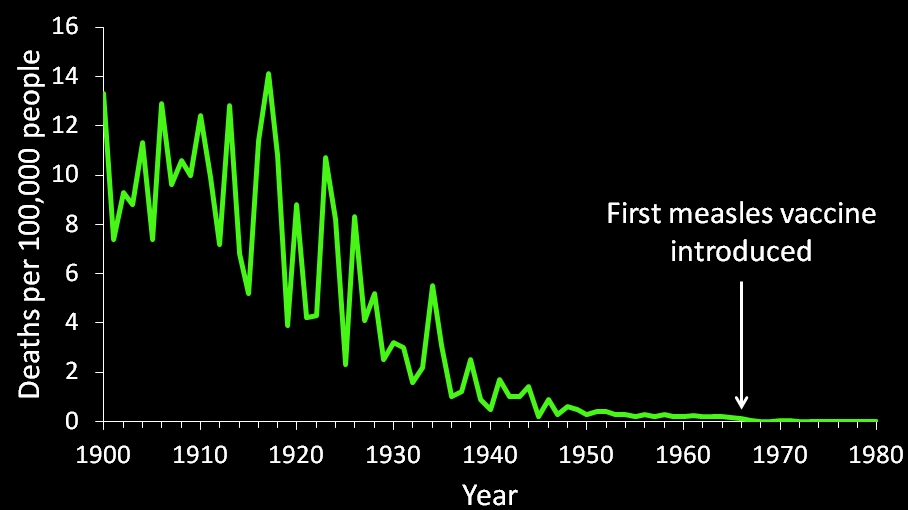
Figure 1: US measles death rates. Anti-vaxxers erroneously claim that this graph proves that vaccines don’t work/didn’t save us (sources are available at the end of the post)
Conversely, pro-vaccine pages present the following graph (Figure 2) as evidence that vaccines do work and helped reduce disease rates.
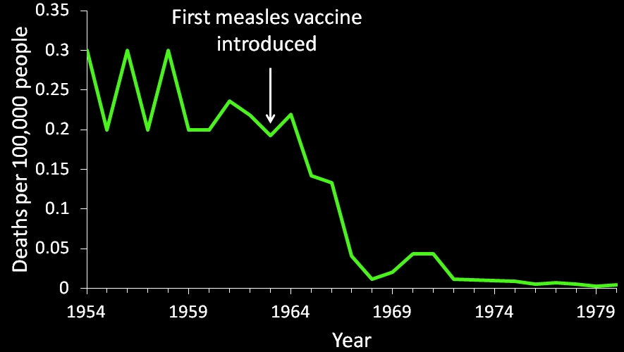
Figure 2: US annual measles death rates before and after the introduction of the vaccine (sources are at the end of the post).
Interestingly, both groups are using the same data, and both groups claim that the other is misrepresenting the data for their own purposes. As I will demonstrate, however, it is the anti-vaccers which are ignoring the rules of statistical analysis and manipulating the data to tell an inaccurate story.
Before I go into the proper analysis for these data, I want to point out that we have tons of evidence other than these graphs on which we base the claim that vaccines work and save millions of lives. For example, numerous experiments have confirmed that herd immunity does work, and having a large number of vaccinated people decreases the community wide disease rates by protecting the unvaccinated (Rudenko et al. 1993; Hurwitz et al. 2000; Reichert et al. 2001; Ramsay et al. 2003). Similarly, multiple studies have documented that introducing vaccines into a population causes the disease and death rates to plummet (Clemens et al. 1988; Adgebola et al. 2005; Richardson et al. 2010). Other studies have clearly demonstrated that people who are vaccinated have lower disease rates than people who are not vaccinated (Schmitz et al. 2011). Finally, there have been numerous documented instances of disease outbreaks accompanying low vaccination rates (Antona et al. 2013; Knol et al. 2013). All of this is incontrovertible evidence that vaccines do work and do play a vital role in saving us from disease. So, without even looking at the anti-vaccer graphs, we can tell that something about their argument is wrong, because we have a mountain of experimental evidence which says that vaccines save lives.
Nevertheless, let’s take a look at the anti-vaccine graphs and see if we can figure out what’s going on. First, it is important to realize that anti-vaccers are correct that death rates from measles had declined greatly prior to vaccines. This was largely due to improved medical treatments that allowed people with measles to have a higher chance of surviving (more on that later). The fact that measles death rates had declined prior to vaccines does not, however, mean that vaccines didn’t play an important role. This is the problem with the anti-vaccine graph, it is deliberately zoomed out so far that you can’t see the impact of vaccines. That is why the pro-vaccine graph is a better representation. It’s not zoomed in as an effort to conceal something, rather it is zoomed in because that is the only way to see that vaccines did actually have an important impact.
Anti-vaccers typically take one of two approaches to dismiss the obvious drop in measles death rates after vaccines. The first is simply to downplay it. For example, anti-vaccers are fond of stating that the death rate from measles (deaths/per a population of 100,000 people) had declined by almost 100% before vaccines. That claim is actually true, but what they ignore, is the fact that after vaccines, it dropped by almost 100% from the pre-vaccine rate. In other words, in the 10 years preceding the first measles vaccine (1953-1962) there were an average of 0.25 measles related deaths per 100,000 people per year, and in the first 10 years after 1968 (when the much more effective live vaccine was introduced) there were an average of 0.017 measles related deaths per 100,000 people per year. As I’ve previously explained, this means that in the ten years before the vaccine, an average of 440.3 people died every year from measles, and in the ten years following the live vaccine, an average of only 34.5 people died annually from measles. In my opinion, saving over 400 people annually is a big deal.
The second strategy is simply to claim that the drop in death rates was just a continuation of the previous trend, and vaccines weren’t responsible. A quick glance at Figure 2 is enough to debunk that claim, but let’s look more closely. To do this, we are going to have to do some math. The decrease in measles deaths prior to vaccines exhibits a mathematical property known as an exponential decrease. This lets us calculate the rate of decrease and extrapolate it out into the future. So, let’s look at the data from 1912-1962 (Figure 3; note: 1912 was chosen as an a priori starting point because it is the first date for which I was also able to find measles infection rates [more on that later] and picking an earlier date would actually make things worse for the anti-vaccers, so its not cherry-picked. 1962 is the last year prior to vaccines).
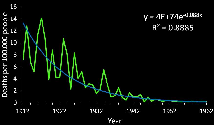
Figure 3: Exponential decrease in US annual measles death rates prior to vaccines (sources are at the end of the post).
The exponential trend line in in Figure 3 is very informative, because it shows that the decrease in measles deaths had reached an asymptote prior to vaccines. Mathematically, that means that we only expect a very gradual decline following 1962. In fact, we can use the equation of a line to calculate future declines (the R2 is a just statistical measure of goodness of fit, and 0.8885 for this many data points is a very good fit, meaning that the trend line should be very accurate). So, let’s look at the death rate 10 years after the first vaccine was introduced. In 1973, there were only 0.01 measles deaths per 100,000, so if we plug that value into the equation as our Y, then we can solve for X (the date). If the decrease in deaths was not from vaccines, then we expect the calculation to give us a date that is close to 1973, but when we actually do the math, we find that we should not get a death rate of 0.01 until 2004! In other words, the death rates following the vaccine are much, much lower than what we would expect if the vaccine wasn’t having an effect, and 1973 was not a cherry picked date, for any post-vaccine death rate that you enter, the line says that we shouldn’t see it for several decades after we actually saw it. To update this for us, over the past decade, there have been an average of 0.00013 measles related deaths in the US (note: I used 2005-2014 because 2015 data is not yet complete, and I assumed that the possible measles deaths in 2009 and 2010 were actually from measles, failing to make that assumption makes things even worse for the anti-vaccers). So, when we plug 0.00013 in as our Y value, we should not see our current death rates until 2053! This is clear mathematical evidence that the measles vaccine is saving lives every year. This is, of course, common knowledge to the scientific community. For example, the WHO estimates that the measles vaccine saved 15.6 million lives world-wide from 2000-2013.
I realize that exponential regression isn’t everyone’s cup of tea, so I want to look at the same basic situation from another angle. Everyone seems to focus on death rates, but the infection rates actually give a clearer picture (Figure 4).
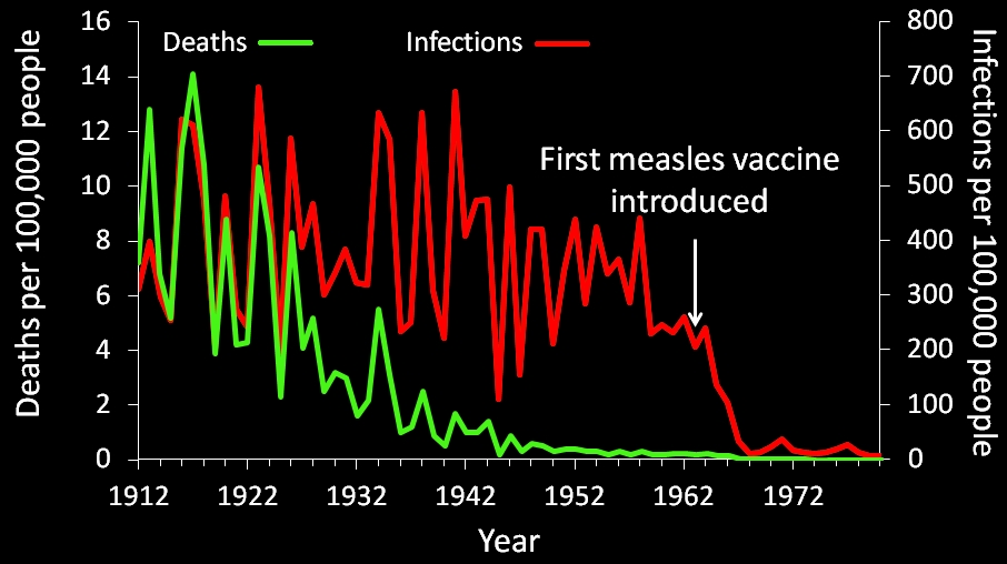
Figure 4: US measles infection and death rates prior to and following the introduction of the measles vaccine (sources are available at the end of the post).
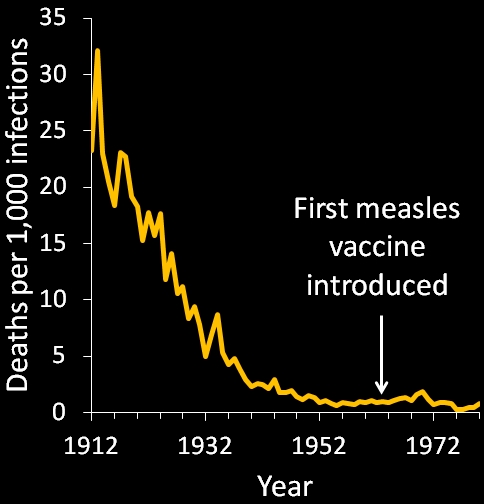
Figure 5: US annual measles mortality rates prior to and following the introduction of vaccines (sources are at the end of the post)
What you can clearly see from Figure 4 is that unlike death rates, measles infection rates had not declined prior to vaccines. Indeed, actually running a linear regression analysis on the data (1912-1962) reveals a P value of 0.121, and to be statistically significant, the P would need to be less than 0.05. In other words, there is no significant decrease in infection rates. This is extremely important because it debunks the anti-vax trope that “clean water and improved sanitation eliminated diseases.” What this graph tells us is that the number of people who were surviving measles increased without vaccines, but the number of people who were getting measles had not changed. Indeed, if we look at the mortality rates of those who were infect by measles (Figure 5), we can see that they leveled off before the vaccine was available. In fact, in the years immediately prior to the vaccine, the average mortality rate was roughly 1 in 1000 (i.e., 1 out of every 1000 infected people died), and that is the same mortality rate that we have today. Together, these data paint a very clear picture: medical advances had improved the survivorship of those who became infected, but it had done nothing to eliminate the disease itself. This means that the number of people who became infected was the factor controlling the annual number of deaths, and it is abundantly clear that vaccines were responsible for reducing the annual number of infections.
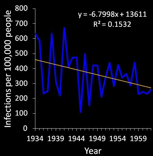
Figure 6: A statistically invalid decrease in US measles infection rates prior to vaccines. This graph is a copy of one that was made by the always inaccurate International Medical Council on Vaccination
Of course, not everyone agrees with me. The perpetually terrible and counter-factual “International Medical Council on Vaccination” claims that the rate of measles infections was actually declining prior to vaccines. Their “evidence” for this claim is a graph (replicated in Figure 6) that simply shows that they are as bad at statistics as they are at logic. You see, the graph goes from 1934-1962 even though we have data going all the way back to 1912. So why did they start at 1934 instead of 1912? Quite simply, because 1934 is the only year that gives them a significant result. In other words, they cherry picked it. Whenever you are analyzing a data set like this, you need a justification for using the date range that you use. Usually, it is best just to use the whole set, but sometimes it may make sense to look only at a ten year period or some subset like that, but if you are going to choose a seemingly arbitrary 29 year period, you need a good justification for it, and they don’t have one. The reality is that if you run a linear regression on those 29 years, you do in fact get a significant result, (P = 0.036), but the years around it don’t yield anything significant. If we start with in 1933 we get P = 0.055, if we start in 1935 we get P = 0.101, and if we look at the ten year period before the vaccine we get P =0.108. In other words, what they did to produce that figure was not statistically valid because they cherry picked their data. You cannot just pick the data points that suit your argument and ignore the rest (note: this is the same problem that you get with the “global warming pause” argument: the dates are cherry picked). Finally, just to be totally fair, let’s ignore the fact that they are clearly wrong about the decline, and take a look at the regression line. Just as before, let’s use the 1973 data (10 years after the first vaccine) and plug that in for our Y value. There where 12.6 cases of measles per 100,000 people in 1973, but, according to their regression line, we shouldn’t see a value that low until 1999. Again, 1973 wasn’t cherry picked, you get the same story if you use 1972, 1974, etc. My point is that the observed decline does not match their predicted decline, which clearly indicates that their predicted decline was wrong. The best explanation for the observed decline is that vaccines are effective and were responsible for the decline in disease rates.
Conclusion
In summary, the notion that vaccines did not save us from disease is a distortion and misrepresentation of the facts. It is true that death rates had declined prior to vaccines, but this was from improved medical practices and treatments, and actual infection rates had not decreased significantly. It is, therefore, completely dishonest to say that vaccines did not play a major role in eliminating diseases, and the data clearly show that we would have much higher disease rates and fatalities today if it were not for vaccines.
Data
The primary data for this post were compiled from several sources. Mortality rates for 1900-1960 were collected from Vital Statistics Rates in the United States, 1900-1940 and Vital Statistics Rates in the United States, 1941-1960. Infection rates were collected from the Census Bureau No. HS-18. Specified Reportable Diseases-Cases per 100,000 Population 1912 to 2001. Additional data (after 1960) were collected from CDC Appendix E Reported Cases and Deaths from Vaccine Preventable Diseases, United States, 1950-2013. In some cases it was necessary to calculate rates based on total numbers and population sizes. Population size data were collected from Google Fusion Tables US Population 1776 to Present. The data can be downloaded as a spreadsheet here.
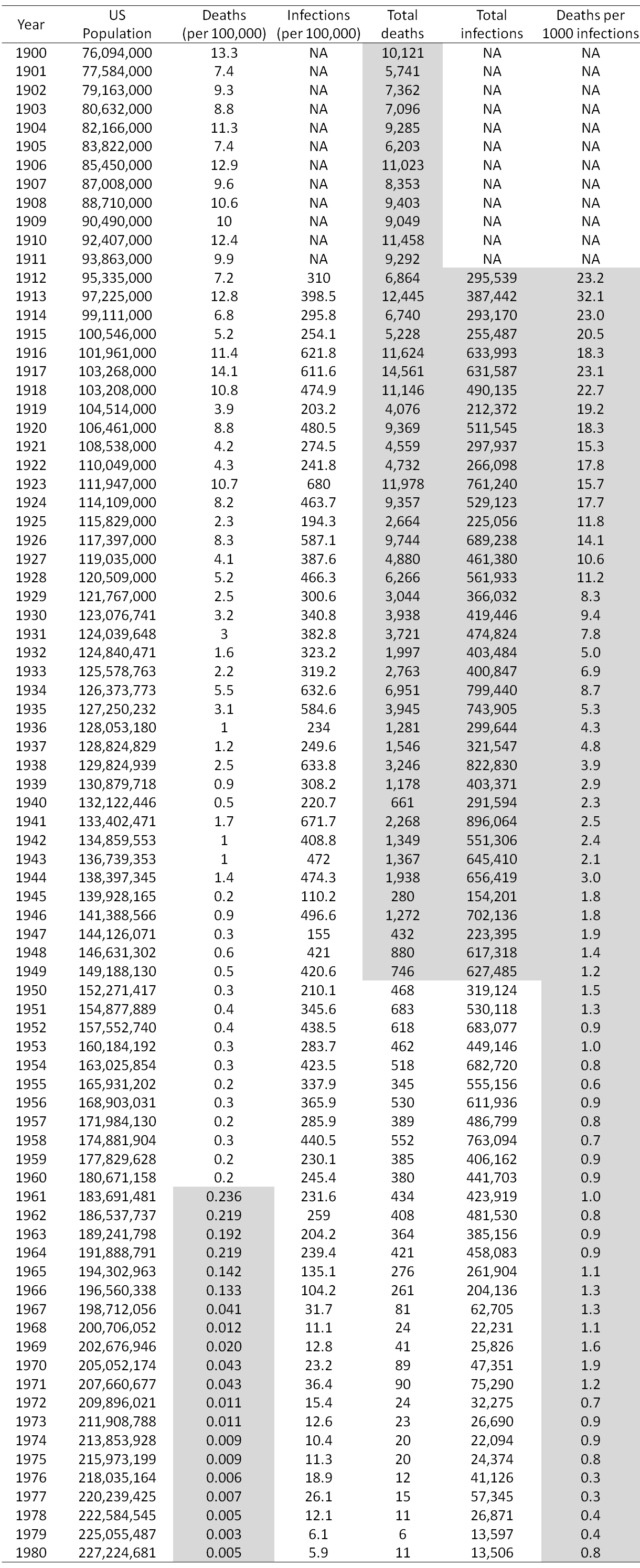
Table of annual measles infections and deaths in the US from 1900 to 1980. Shaded cells contain data that were calculated from data in the other cells. All other data came from the sources listed above. The table can be downloaded as an Excel spreadsheet here.

nevertheless..? maybe the query should read ” will it ? ”
rjb
LikeLike
The data really seem to contradict your point. The “cherry-picking” argument seems extremely thin, as you do not demonstrate the error using the additional data available.
This site did nothing but convince me the anti-vaccers have a point.
LikeLike
Bill, try re-reading it slower next time.
LikeLike
I don’t understand your comment at all. The entire post is about how the additional data shows that vaccines are responsible for the reduction in disease rates. Can you please elaborate on what you mean?
Just to give one obvious example, figure 4 includes the infection rates which is a massive data set that anti-vaccers tend to ignore, and which clearly shows that the decline was from vaccines.
LikeLike
Thank you for so detailed annalysis. If you can pls send lle this excel data. Speaking about MMR vaccine, do you have data how many people who got infection after MMR vaccine has been introduced were vaccinated against measles and how many not vaccinated? How many of them were adults, and how many children, how many babies?
LikeLike
Unfortunately, I don’t have any vaccination status or demographic data. Can you please send me your email address via a facebook message so that I can email the Excel file to you?
LikeLike
Every source used here which I checked on was funded by vaccine manufacturers. There are SERIOUS competing interests here!!! I am writing this rubbish off. Use non-industry sources for goodness sake! Shame on you!
This article is dishonest! Anyone reading this should go ahead and research these sources and see for themselves!!!!
LikeLike
First, I truly don’t understand your comment because this entire post was simply an analysis of a data set. Only one paragraph was an explanation of peer-reviewed studies, and that paragraph was tangential to the argument that I was making. The data for my main argument, on which all of the figures, and every paragraph except one were based, came from sources like the CDC and Census Bureau. They are simple reports of the numbers of infections and fatalities, and they are reports which no one contests (they are the same data sets that anti-vaccers readily use). So your comment doesn’t makes sense because it doesn’t apply to the primary argument that this post is about. As such, it strikes me as a cop-out and unwillingness to consider the actual issue at hand.
Second, let’s look at the paragraph where I cited peer-reviewed studies. Out of curiosity, I checked the first four sources that I cited. The first two had no ties to pharmaceutical companies. The authors were not associated with them and they did not reported any funding from them or conflicts of interest. So while you accuse me of being dishonest, you clearly did a very poor job of checking the sources since you missed the first two. The third source also had no funding from pharmaceutical companies. A few of its authors were admittedly associated with companies, but most of them were not. For the fourth source, none of the authors worked for pharmaceutical companies, but they did receive research funding from them. To be clear though, research funding simply means that the company paid for the expenses of the study, it does not mean that the researchers were paid off to falsify data. So out of the first 4 sources, only 1 was funded by pharmaceutical companies. I didn’t bother to check the rest, but given that I only cited a total of 10 peer-reviewed sources in this post, your claim is rather dubious (dare I say “dishonest”).
This brings me to my final point. You cannot simply ignore a source because of a conflict of interest. That’s not logically valid. The presence of a conflict of interest simply means that you should give it extra scrutiny, not that you should blindly reject it.
In summary, your criticism isn’t accurate and doesn’t even remotely apply to the core of this post. You have not in anyway shape or form addressed the content of the post. Further, even if your criticism was true, its not a logically valid argument, so its irrelevant.
LikeLike
After writing my previous comment, I realized that there was one other peer-reviewed study that I cited that wasn’t in the aforementioned paragraph, so I check it, and it also had no ties to or funding from pharmaceutical companies. So that’s at least 4 sources which are conflict free.
LikeLike