To many people, this may seem like the most boring topic in the world, but it is actually vitally important not only for understanding scientific results, but also for understanding much of the data that we are presented with on a daily basis. We are constantly confronted with claims about the “average” from friends, scientists, doctors, politicians, etc., but in many cases, those data are being presented in a misleading or even deceptive way, and you should be able to spot that deception. For example, during the first calendar year of my blog, my posts were viewed an average of 9,272 times per post. When faced with a number like that, you would normally expect that roughly half of my posts had more than 9,272 views, and roughly half had fewer than 9,272 views. In reality, out of 81 posts, only 12 had more than 9,272 views! You see, this data set is not one that can be accurately analyzed using the calculation that most people refer to as the average (what scientists call the mean), so I presented you with an unrealistic view of my blog by using an inappropriate measure of the central tendency of the data. This example is, of course, trivial, but people do this all the time. You can find plenty of scientific publications that made this blunder, politicians frequently cite inappropriate statistics like this, etc. So I think that it is very important for people to understand the different types of data distributions and how they should be analyzed.
Note: I want to clarify upfront that in this post I am making generalizations about understanding the central tendency in the type of data sets you are likely to encounter in your daily lives. There are certainly exceptions, particularly when you get into statistical modeling, where there are many different distributions, and you often use a mean in association with multiple other variables to understand and analyze them. Those sorts of situations are not what I am talking about here. Rather, I am trying to give a general introduction to means and medians and why it can sometimes be misleading to report means. Again, the goal here is that if you hear a politician, science reporter, etc. say, “the average was…” you should be able to tell if that is biased measure of central tendency in that case. That is the context in which I am making statements like, “the mean is useful for…”
Means, medians, and modes
For most data sets, we are interested in knowing the central tendency of the data. This is generally accomplished by presenting a single number that summarizes the data and presents a value that you expect most of the data points to be near. Most people do this by presenting an “average.” As all of you hopefully know, you calculate the average value by adding all of the data points together, then dividing by the total number of data points (scientists refer to this statistic as the “arithmetic mean”). This is by far the most common measure of central tendency among the general public, but it is not the only one, and in many cases, it is a horrible statistic to use (more on that later).
The primary alternative to the mean is what is known as a median. For this statistic, you line all of your data points up from smallest to largest, and the median is simply the middle value. For example, if your data points were: 2, 4, 5, 7, and 30, the median would be 5 (in contrast the mean would be 9.6). In situations where you have an even number of data points, you simply take the mean of the middle two. In other words, if your data points were: 2, 4, 7, and 30, then the median would be 5.5 ([4+7]/2).
Finally, we also have the mode. This is simply the value that appears most often. This statistic is generally not appropriate for numerical data because it doesn’t really show you the central tendency in most cases. It is however useful for nominal data. In other words, when you are simply counting things by category. For example, if you wanted to know the most popular brand of car in your neighborhood you might count them all. Now, suppose that you did that and you found 20 Toyotas, 5 Fords, and 6 Chevrolets. You obviously can’t take a mean or median, but you can report that there were more Toyotas than anything else. That’s a mode (again, you can do that with actual numbers as well, but it often doesn’t tell you much). I thought that it was important to explain what a mode was, but for the remainder of this post I really want to focus on means and medians, because they are the ones that often get used inappropriately (especially the mean).

Figure 1: This shows three different types of symmetrical data distributions. (A) shows a normal distribution, which is the only type of data distribution for which means are appropriate.
Data distributions: when can’t you use means?
Now that we have established what means and medians are, we can talk more about when they can and cannot be used, but to do that, we need to talk about data distributions. As I mentioned in the opening paragraph, when we talk about averages, we generally think that roughly half the data points should be above the mean and half the data points should be below it. Indeed, that intuition is correct. In order for the mean to be really useful, that situation should be roughly true, but if you think back to our definitions of means and medians, you will realize that what we have just defined is a median, not a mean. This brings me to the most important point of the entire post: as a general rule, if you are interested in knowing the central tendency of your data, means are more informative when the data are normally distributed, but they can be very problematic when the data are skewed to one side (as noted earlier, there are exceptions). The easiest way to explain what I mean by that is simply to show you, so look at Figure 1A on the right. This is what we call a “bell-shaped” or “normally distributed” data set, and the mean is at 11, which is exactly where we expect it to be (on a side note, for data sets with a perfectly normal distribution, the mean and median will always be the same).
Technically speaking, you can also use a mean anytime that the data have a symmetrical distribution (i.e., if you folded the graph in half, both sides would be the same), but as you can see in Figure 1B and 1C, although you could report a mean, the mean is still not very useful. In Figure 1B, all of the values are equally frequent, so there isn’t really a central tendency, and in Figure 1C, the distribution is bimodal, so there are really two central tendencies. Data sets like either of those are, however, fairly rare, and the far more common alternative to a normal distribution is a skewed distribution (Figures 2 and 3).

Figure 2: This shows a data set that would be normally distributed if it wasn’t for one data point that is way out at 10,000. That data point gives it an extremely long tail, which results in a very inaccurate mean. As a general rule, the longer the tail, the less accurate the mean is. In contrast, medians are affected by the number of data points on the tail, but the length of the tail is irrelevant. Note: I gave this figure an extremely long tail to illustrate how much one huge outlier can affect means, but the distributions in Figure 3 are more typical of what we mean when we say that a distribution is “skewed.”
When we say that a distribution is “skewed” we mean that it is not symmetrical like a normal distribution. Rather, the data clump on one side with a “tail” stretching off to the other side. We would further describe the graphs that I have illustrated here as either “right-skewed” or “right-tailed” (because the tail is on the right). Skewed data sets like this are extremely common, but you often cannot use a mean to describe them, because the mean gives you a misleading view of the data. For example, in Figure 2, the median is 11, which makes sense based on just looking at the data. In other words, 11 is a good description of the central tendency of that data set, and saying that the median = 11 tells you something useful. In contrast, the mean for that data set is 20.8, which is obviously a terrible representation of the central tendency of that data set. Almost all of the data points are less than 20.8, and that statistic is extremely misleading.
So what’s going on here? Well this data set has an extremely long tail because there was one data point all the way out at 10,000, and if you think about the math behind the mean, it should be obvious that having a single data point that is so much higher than all of the rest will seriously bias a mean (this is the same thing that happened with my blog data). In contrast to the mean, the median will still be robust because it just ranks that data, then selects the middle data point. So it wouldn’t matter if that last data point was ten thousand or ten trillion, the median would be same (in contrast, the mean will keep going up).
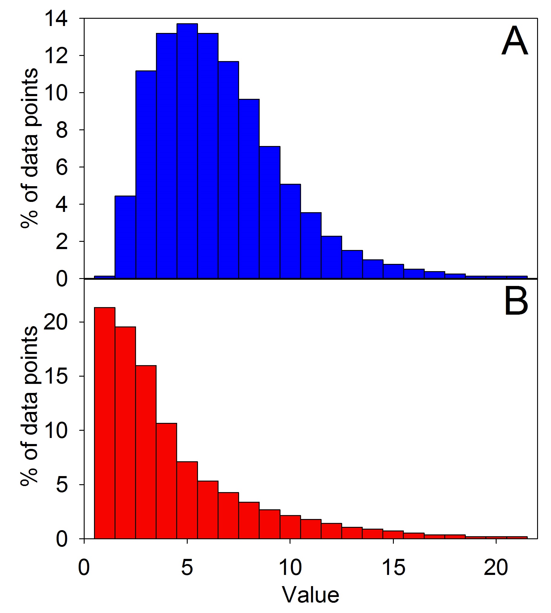
Figure 3: This shows two different right-skewed data sets. The more skewed that they become, the less accurate the mean is. Although Figure 2 is technically skewed, when we use that term to describe data, we are usually referring to distributions that look more like this.
From what I have just said, it should make sense that the length of tail and the number of data points on the tail have a huge effect on whether or not you can use a mean. Consider, for example, the two panels in Figure 3. Both are still right-skewed, but not nearly as severely as Figure 2. Indeed, 3A doesn’t look that far from a normal distribution and, in fact, the mean and median are pretty similar (6.5 and 6, respectively). So although the median is a better statistic, the mean is still pretty good. The more skewed that we make it, however, the further that the gap between those two becomes. In 3B, for example, the media is 3, whereas the mean is 4.3.
All of that may have seemed complicated, so let me boil it down to two take home messages. First, means are reliable measures of the central tendency when the data are normally distributed (or at least close to normal), but when the data are skewed and you have many outliers, the median generally gives you a better representation of the data. Second, the more skewed that a data set is, and especially the longer that its tail is, the less reliable the mean becomes.
Note: There are cases in which the typical relationships between means and medians that I have presented do not hold true, but these generally occur for discrete variables rather than continuous variables. A discrete variable is simply one for which there are a finite number of values, such as count data (e.g., the number of individuals per household would be discrete because you can’t have a fraction of a person). Continuous variables are ones for which there are (at least in concept) an infinite number of values (e.g., measurement data). For more information, please read Hippel 2005. Mean, Median, Skew: Correcting a Textbook Rule. Journal of Statistics Education 13.
How to tell if means are being used correctly
At this point, you may be wondering how on earth you are supposed to tell when someone is using a mean when they should be using a median, and there are a couple of things to watch out for. First, familiarity with the type of data being worked with is usually very helpful, because if you know something about how those distributions generally appear, you can often intuit what the distribution will probably look like. Let me give you an example. If someone is reporting the mean income for all of the US, do you think that is appropriate? Well, if you know anything about the wealth distribution in the US, then you know that there is a very large lower and middle class, accompanied by a tiny upper class that makes way, way more than the other two classes. Now, picture in your mind what that distribution will look like. You should be picturing a very skewed graph with most people in the low to moderate income categories on the left, and a few rich people way out on a tail on the far right, and, indeed, that is what the distribution looks like. So in that case, people should be reporting medians, not means (note: I am not making any political statements here, I am just using a simple example that most of my readers should be familiar with).
To be clear, I’m not suggesting that you go with your gut instead of actually looking at the data, but background knowledge about the type of data being presented is useful as a first pass filtering mechanism to see if any red flags go up. It is also one of the reasons why it is important to be knowledgeable in a particular scientific field when trying to assess that literature. Knowing what the data sets for a given topic typically look like helps you to spot shoddy statistics.
In cases where you can’t intuit or easily look up the distribution, ranges become really important. If, for example, someone tells you that the mean for something is 100, that isn’t very useful without out also knowing something about the distribution of data around that mean. Standard deviations and variances are generally really useful for that purpose, but for checking normality, the range is far more valuable, because it gives you the highest and lowest values. Suppose, for example, that you were told not only that the mean was 100, but also that lowest value was 10 and that the highest value was 110 (i.e., the range was 10–110). That tells you something very useful about the data, because it tells you that the data has a long left tail (i.e., it is left-skewed), which also tells you that the mean might be misleading and is not capturing the central tendency particularly well.
Conclusion
There are several key things to take away from this post. First, people often report averages (means), but it is often misleading to do so, and you should be cautious of them. Means are generally most informative as a measure of central tendency when the data are fairly close to a normal distribution, and when the data sets are skewed, you often should use medians, not means. As a result, when someone presents you with a mean, you should think about the distribution of the data and look at other pieces of information such as the range.
As a fun concluding exercise, I want you to evaluate two technically true claims:
Claim 1: The average number of followers per Twitter account is 208.
Claim 2: The average height of women in the USA is 163 cm.
The goal here is to assess whether or not the mean is a useful measure for the central tenancy of the data for those two data sets. So, for both claims, I want you to think about how you expect the data to look. Think about the types of accounts that often exist on Twitter and the range of human heights, and see if you can intuit what the data sets will look like. Then, actually look into the data a bit and see if you were right. This is a very easy exercise that won’t take you more than a few minutes, but it is the type of skepticism that you should apply to all data sets, so I think that it will be useful for you to actually work through this mentally. Also, yes, I did just assign you homework from a blog post.
The answer for twitter is here, and for height you can just check good old Wikipedia for a comparison of the mean and median.
Related Posts
- Basic Statistics Part 1: The Law of Large Numbers
- Basic Statistics Part 2: Correlation vs. Causation
- Basic Statistics Part 3: The Dangers of Large Data Sets: A Tale of P values, Error Rates, and Bonferroni Corrections
- Basic Statistics Part 4: Understanding P Values
Note: This is the second time that I have posted this basic article. I removed the first version almost as soon as I posted it because someone pointed out that I made several errors and over-generalizations. I did not immediately have time to edit the post, so I simply removed it rather than furthering the spread of misinformation. I have now corrected the post, and I apologize profusely for my mistakes and appreciate having them pointed out to me. I try very hard to write accurate and informative posts, but I am only human and do make mistakes, which is why it is important to fact check everything that you read and hear (including from me). Thank you for not letting me get away with shoddy work.